Buyer Assist
0-1 Design System From Concept to Implementation
Revamp the UX/UI, adding better functionality, guided interactions, hassle-free design hands-off maintaining the design system.

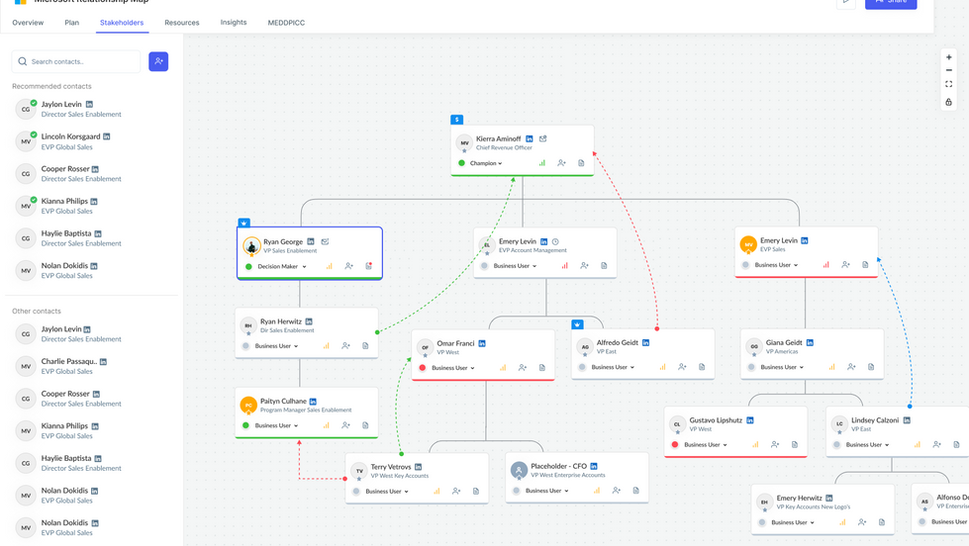
What is Relationship Map?
A Relationship Map in BuyerAssist is a visual representation of stakeholders involved in a B2B buying process.
It helps sales teams:
- Identify decision-makers
- Understand influence dynamics
- Track relationships within complex organizations
- Strategize outreach effectively
In short it turns messy stakeholder spreadsheets into a visual decision-making tool.
Why Does a Relationship Map Matter?
In enterprise sales, buying decisions are rarely made by one person.
Without visibility into:
- Who influences whom
- Who is a blocker
- Who is the champion
Sales teams waste time, miss signals, and lose deals.
The Relationship Map is meant to solve this but the existing experience wasn’t living up to its potential.
refined problem Statement
How might we empower sales teams to quickly and intuitively visualize complex stakeholder relationships without friction or cognitive overload?
Challenges
What Was Broken in the Existing Experience?
Through product exploration and user feedback, we found:
- Static and rigid interactions
- No scalable design system
- Difficult navigation in large org charts
- No contextual guidance for new users
- Cluttered visual hierarchy
Users understood the value of the tool but struggled to use it efficiently.
persona
Who Were We Designing For?
Primary users:
- Enterprise Sales Representatives
- Account Executives
- Revenue Operations Teams
Their goals:
- Quickly map stakeholders
- Identify decision influencers
- Navigate large buying groups effortlessly
- Update relationships without friction
They needed speed, clarity, and confidence.
Goals
What Was the Strategy?
- Create a unified visual language
- Improve design and development efficiency
- Ensure design consistency
- Enable faster product iteration
Validation & Refinement
- A/B testing component designs
- User testing with designers and developers
- Performance benchmarking
Key Deliverables
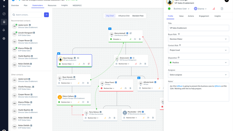
What Did the New Experience Look Like?
The redesigned Relationship Map introduced:
- Clean, modern visual structure
- Clear hierarchy between stakeholders
- Interactive and dynamic connections
- Intelligent filtering and search
- Consistent design language
The experience shifted from static visualization → strategic interaction..


Quantitative Results
Changes After the Redesign
- 65% reduction in design iteration time
- 40% faster product feature development
- 90% design consistency across platforms
Qualitative Outcomes
- Improved cross-functional collaboration
- more predictable design process
- Scalable design approach
Final product & Usage of Components


next step
- Conduct structured usability testing with metrics
- Introduce collaboration features (shared editing, comments)
- Add predictive relationship insights
- Explore integration with CRM workflows
Learnings & Recommendations:
- Start small, iterate quickly.
- Involve all stakeholders early
- Create clear governance model
- Treat Design System as a product