A bit about Me

Here's my story, plus a little extra.

How it all Started

Back when I was 15, in the early days of Facebook and Instagram, I loved editing photos for myself and friends. I got into filters, color grading, and creating small event posters. Before that I used to participate in drawing competitions and win city-level prizes.

As I grew older and started traveling at 18, smartphones and cameras became a thing, and I got into capturing moments, making short travel videos by adding music, transitions, and some color grading.

How college kickstarted my UX career

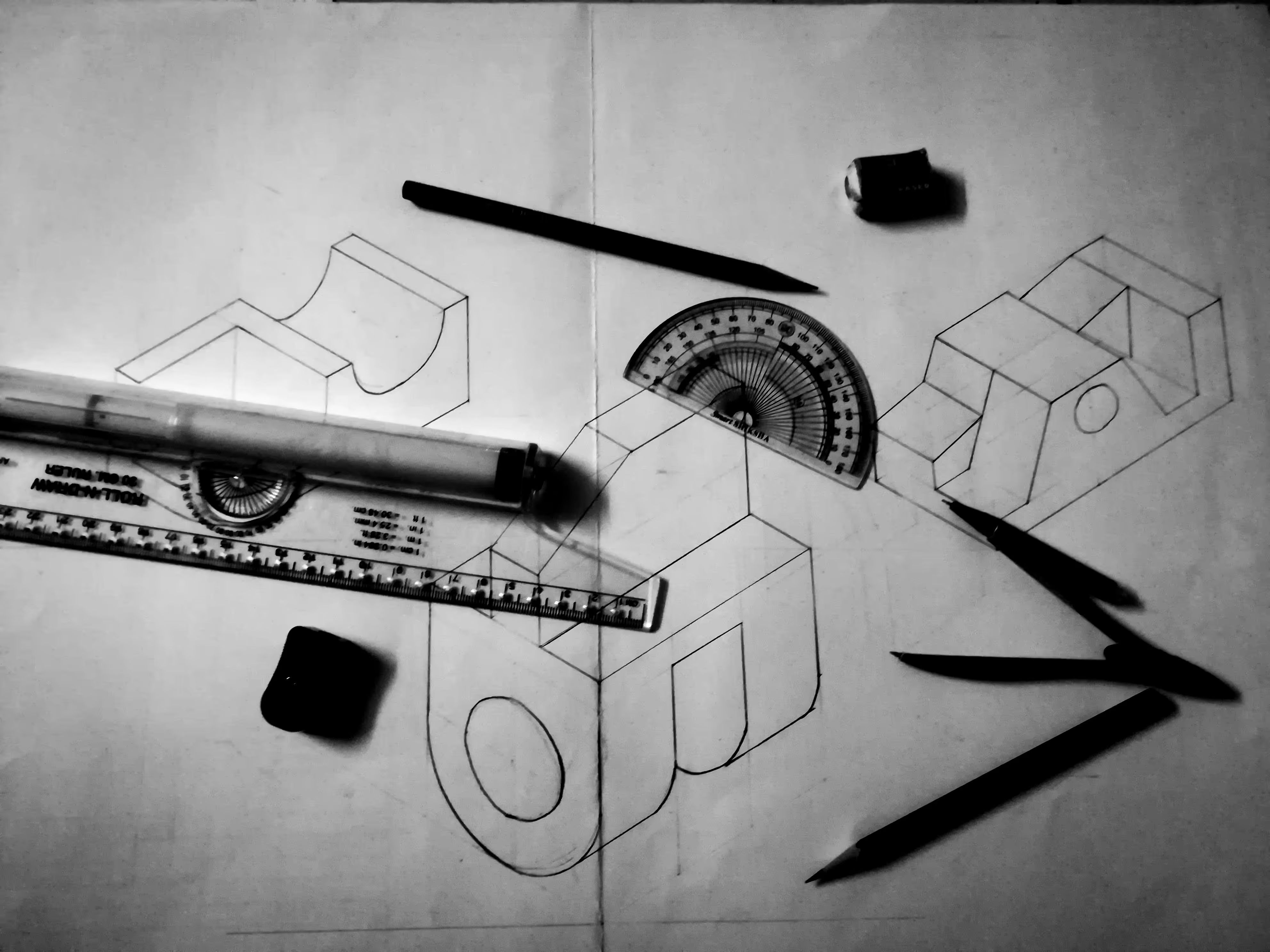
My college journey kicked off with Electronics and Telecommunications. But my favorite subject in the first year was Engineering Graphics, where I used to teach toppers, and I topped the whole class in the same subject. I started using computer graphic software to create event posters. I was the Creativite Head in IEEE club, where I used to create event design, event flow, marketing for the event, and social activities.

I then headed the ENTC branch as Creative Head for Annual Techtonic Festival. Though skething and drawing was my basic skill I started learning the career in product design during college and experimenting my desing skill.

I started designing stuff for friends and got into figuring out UX/UI basics on my own. A pivotal point was a freelance project during my second college year, redesigning websites.  That was my first real project.
Leveling Up

To refine my design skills and get the UX knowledge, I opted for the course UX Jumpstarter by ImaginXP during my last year of engineering. I learned UX psychology and details that go inside design product screens.

As soon as college was over and I got the certifications for design, I joined Nitrous Design Studio in a walk-in interview, and the studio was not even hiring at that point in time, but they hired me based on my skills and potential.

Designing for AI Startups

I got hired as a Product Designer at BoomerangAI, it was called BuyerAssist back then. I transitioned from desiging for services and websites to designing for B2B SaaS Product Company. I designed new product flows, redesigned the product, and created a fresh design system, and then the market surge in AI a & pivot happened.

BuyerAssist pivoted to BoomerangAI, and then the whole journey started from scratch. From product designer I became the founding product designer. I had designed the branding, marketing, website, and product. Thats a lot but helped me to become who I m today.

Words of Appreciation

Vignesh G

Associate Director - Product Design at Method

“Nilesh has excellent interaction skills that engage users through impactful visuals and create strong brand recall. He brings a sense of fun and positivity to every collaboration.”

Nishant Jain

CEO - Nitrous Design Studio

“This young professional’s growth at Nitrous Design has set a benchmark in our studio. Highly ambitious, he collaborates seamlessly with cross-functional teams and consistently raises the bar.”

Winding down..

When work takes a back seat, I enjoy traveling - I mean, who doesn't? Also, I love clicking photos and videos. Besides, I play football and enjoy going on long drives with some deep beats.Yup that's all about me :)

Oh wait 🐾

Meet Frank, and this is another source of my getaway. Okay bye!

Structure Classes

Defined and flexible core structure we can use on all or most pages.

page-wrapper
main-wrapper
container-small
container-medium
container-large
padding-global
padding-section-small
padding-section-medium
padding-section-large
button-group

Headings

HTML tags define default Heading styles. Use Heading classes when the typography style doesn't match the default HTML tag.

H1

Sample text helps you understand how real text may look. Sample text is being used as a placeholder.

heading-style-h1

Sample text helps you understand how real text may look. Sample text is being used as a placeholder.

H2

Sample text is being used as a placeholder. Sample text helps you understand how real text may look.

heading-style-h2

Sample text is being used as a placeholder. Sample text helps you understand how real text may look.

H3

Sample text helps you understand how real text may look on your website. Sample text is being used as a placeholder for real text that is normally present.

heading-style-h3

Sample text helps you understand how real text may look on your website. Sample text is being used as a placeholder for real text that is normally present.

H4

Sample text is being used as a placeholder. Sample text helps you understand how real text may look. Sample text is being used as a placeholder for real text that is normally present.

heading-style-h4

Sample text is being used as a placeholder. Sample text helps you understand how real text may look. Sample text is being used as a placeholder for real text that is normally present.

H5
Sample text is being used as a placeholder. Sample text helps you understand how real text may look. Sample text is being used as a placeholder for real text that is normally present. Sample text helps you understand how real text may look.
heading-style-h5
Sample text is being used as a placeholder. Sample text helps you understand how real text may look. Sample text is being used as a placeholder for real text that is normally present. Sample text helps you understand how real text may look.
H6
Sample text is being used as a placeholder for real text that is normally present. Sample text helps you understand how real text may look. Sample text is being used as a placeholder for real text that is normally present. Sample text helps you understand how real text may look.
heading-style-h6
Sample text is being used as a placeholder for real text that is normally present. Sample text helps you understand how real text may look. Sample text is being used as a placeholder for real text that is normally present. Sample text helps you understand how real text may look.

Other HTML Tags

HTML tags define default text styles.

All paragraphs

Sample text is being used as a placeholder for real text that is normally present. Sample text helps you understand how real text may look on your website. Sample text is being used as a placeholder for real text.

All links
All Links
All quotes
Sample text is being used as a placeholder for real text that is normally present. Sample text helps you understand how real text may look on your website.
All Ordered Lists
  1. Sample text is being used as a placeholder for real text that is normally present.
  2. Sample text is being used as a placeholder for real text that is normally present.
  3. Sample text is being used as a placeholder for real text that is normally present.
All Unordered Lists
  • Sample text is being used as a placeholder for real text that is normally present.
  • Sample text is being used as a placeholder for real text that is normally present.
  • Sample text is being used as a placeholder for real text that is normally present.

Text Classes

Text classes when typography style doesn't match the default HTML tag.

Text Sizes

text-size-large

Sample text is being used as a placeholder for real text that is normally present.

text-size-medium

Sample text is being used as a placeholder for real text that is normally present on your website.

text-size-regular

Sample text is being used as a placeholder for real text that is normally present. Sample text helps you understand how real text may look on your website.

text-size-small

Sample text is being used as a placeholder for real text that is normally present on your website. Sample text helps you understand how real text may look on your website.

text-size-tiny

Sample text is being used as a placeholder for real text that is normally present on your website. Sample text helps you understand how real text may look on your website.

Text Styles

text-style-strikethrough

text-style-strikethrough

text-style-italic

text-style-italic

text-style-muted

text-style-muted

text-style-allcaps

text-style-allcaps

text-style-nowrap

text-style-nowrap

text-style-link
text-style-quote

Sample text is being used as a placeholder.

text-style-2lines
This CSS style is not supported for Rich Texts on iOS.

Sample text is being used as a placeholder for real text that is normally present. Sample text helps you understand how real text may look on your website. Sample text is being used as a placeholder for real text text-style-2lines

text-style-3lines
This CSS style is not supported for Rich Texts on iOS.

Sample text is being used as a placeholder for real text that is normally present. Sample text helps you understand how real text may look on your website. Sample text is being used as a placeholder for real text. Sample text is being used as a placeholder for real text that is normally present. Sample text helps you understand how real text may look on your website. Sample text is being used as a placeholder for real text.

Text Weights

text-weight-xbold
text-weight-xbold
text-weight-bold
text-weight-bold
text-weight-semibold
text-weight-medium
text-weight-medium
text-weight-normal
text-weight-normal
text-weight-light
text-weight-light

Text Alignments

text-align-left
text-align-left
text-align-center
text-align-center
text-align-right
text-align-right

Buttons

Button combo class system.

Button / Primary
Button Text
Button / Primary
small
Sign upLog in
Button / Primary
is-large
Button Text
Button / Secondary
View Projects
Navigation Link
About Me
Button / Primary
is-icon
Resume
social-block

Colors

Manage recurring text and background colors.

Text Colors

text-main-color
text-main
text-soft
text-color-secondary
text-sub
text-color-secondary
text-invert
text-color-alternate

Background Colors

background-color-primary
background-color-secondary
background-color-tertiary
background-color-alternate

Max widths

Use the max-width CSS property to contain inner content to a maximum width.

max-width-full
max-width-full-tablet
max-width-full-mobile-portrait
max-width-full-mobile-landscape
max-width-xxlarge
max-width-xlarge
max-width-large
max-width-medium
max-width-small
max-width-xsmall
max-width-xxsmall

Paddings

Utility spacing system - padding classes. [padding-direction] + [padding-size].

Direction Classes

padding-bottom
padding-top
padding-vertical
padding-horizontal
padding-left
padding-right

Size Classes

padding-0
padding-tiny
padding-xxsmall
padding-xsmall
padding-small
padding-medium
padding-large
padding-xlarge
padding-xxlarge
padding-huge
padding-xhuge
padding-xxhuge
padding-custom1
padding-custom2
padding-custom3

Margins

Utility spacing system - padding classes. [margin-direction] + [margin-size].

Direction Classes

margin-bottom
margin-top
margin-vertical
margin-horizontal
margin-left
margin-right

Size Classes

margin-0
margin-tiny
margin-xxsmall
margin-xsmall
margin-small
margin-medium
margin-large
margin-xlarge
margin-xxlarge
margin-huge
margin-xhuge
margin-xxhuge
margin-custom1
margin-custom2
margin-custom3

Spacers

Unified spacer system for the project.

spacer-tiny
spacer-xxsmall
spacer-xsmall
spacer-small
spacer-medium
spacer-large
spacer-xlarge
spacer-xxlarge
spacer-huge
spacer-xhuge
spacer-xxhuge

Icons

Unify icons sizes. icon-height sets height of icons. icon-1x1 sets both height and width of icons.

icon-height-small
icon-height-medium
icon-height-large
icon-1x1-small
icon-1x1-medium
icon-1x1-large

Useful utility systems

Utility classes we like to use in most of our projects to build faster.

hide
This element is hidden
hide-tablet
hide-mobile-portrait
hide-mobile-landscape
overflow-visible
overflow-hidden
overflow-auto
overflow-scroll
pointer-events-auto
pointer-events-none
layer
spacing-clean
align-center
z-index-1
z-index-2
inherit-color
aspect-ratio-square
aspect-ratio-portrait
aspect-ratio-landscape
aspect-ratio-widescreen

Webflow elements

Native Webflow elements with Client-First classes applied.

form_component

Example of a form component using Folders

Thank you! Your submission has been received!
Oops! Something went wrong while submitting the form.
text-rich-text

Heading 1

Heading 2

Heading 3

Heading 4

Heading 5
Heading 6

Sample text with a link is being used as a placeholder for real text that is normally present. Sample text helps you understand how real text may look on your website. Sample text is being used as a placeholder for real text. Sample text is being used as a placeholder for real text. Sample text is being used as a placeholder for real text.

  • Sample text is being used as a placeholder for real text that is normally present.
  • Sample text is being used as a placeholder for real text that is normally present.
  • Sample text is being used as a placeholder for real text that is normally present.
  1. Sample text is being used as a placeholder for real text that is normally present.
  2. Sample text is being used as a placeholder for real text that is normally present.
  3. Sample text is being used as a placeholder for real text that is normally present.
Sample text is being used as a placeholder for real text that is normally present. Sample text helps you understand how real text may look on your website. Sample text is being used as a placeholder for real text that is normally present.

A short overview

EXPERIENCE

Product Design Consultant - AI Agent and Web | Troopr Labs
Remote(Pune) | Apr 2025 - Present 

Product Designer - Sales Tool and Web | Boomerang AI   
Pune | Jan 2023 - Apr 2025

UI Designer - App and Web | Nitrous Design Studio
Pune | Aug 2021 - Jan 2023

CERTIFICATIONS

The AI-Driven Product Designer  - LinkedIn
Generative AI Mastermind  - Outskill
UX for Social Good 
- Google | Coursera
Learn Adobe XD
- LinkedIn

EDUCATION

B.E. in Electronic and Telecommunication
2021 | Savitribai Phule Pune University (SIT Lonavala)

UX-Jumpstarter
2021 | ImaginXP

Thanks for checking in,
reach out anytime.

Mail

nileshbadge02@gmail.com

Phone

+91 9172 3911 83 (alt)